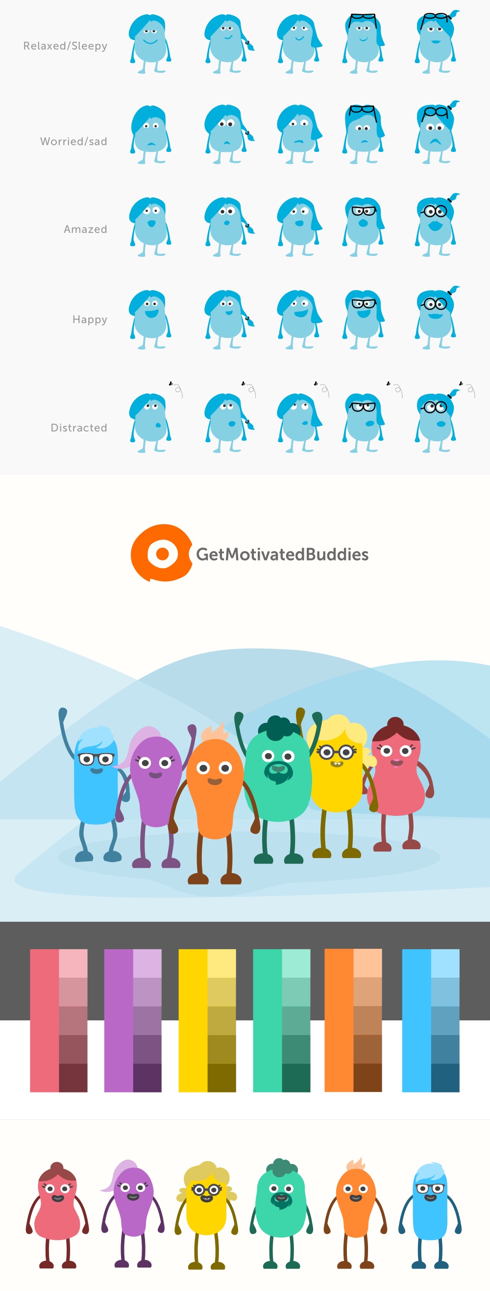
This was a great time as a Lead Designer. I worked closely with the CEO and the development team to structure the product and define the MVP. Then we both collaborated to define a specific design voice who would guide us through the complex process of creating a complete social network.
After understanding the complexity of the entire product we decided to define several phases and work in each of the components with the big picture in mind, releasing functionalities one by one to gradually get the first users and add up their feedback as an extra input to keep designing the product.
On the design side, my role covered a wide variety of tasks also **outside of User Experience and User Interface. I was also in charge of the brand identity, visual material for emails/marketing, avatar design, investor decks design…
During long periods of design discussions we developed a final wireframe structure using Invision and static images to simulate the basic functionalities of the MVP and after approving it we jumped into Interface Design.
Semantic UI was the chosen framework to base our design on. Once we had some basic components designed we started working on more fine details and one by one the different specifications were reached.
I defined a design system with many components inside Sketch to be able to design consistently with the UI, following Semantic UI and making Development team’s life easier.


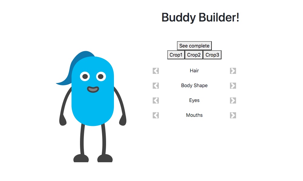
While designing the different “buddies” I decided to prepare a small html tool to swap out the different componentes as mouth, hair, eyes , body shapes and so on. That way it was easy to test all the shapes and to show the devloppers how to imprement the buddy creation tool.

